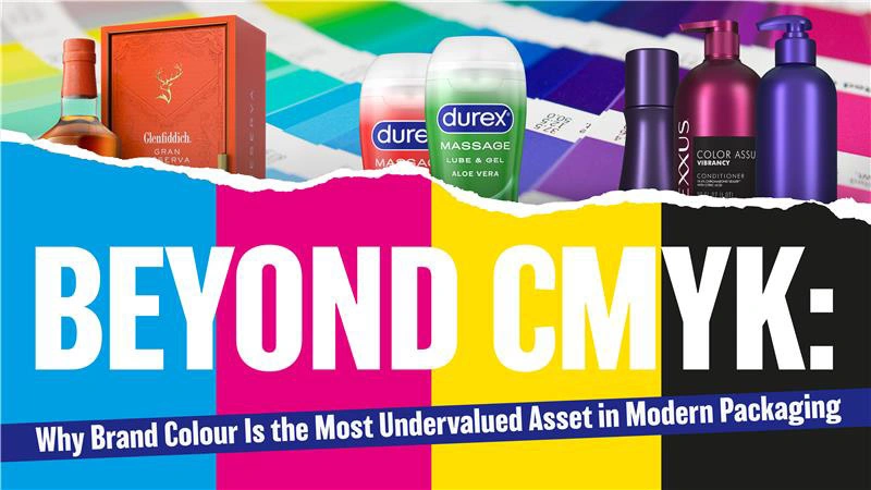
Beyond CMYK: Why Brand Colour Is the Most Undervalued Asset in Modern Packaging – Trident’s perspective on the commercial cost of colour compromise
The $4.2 trillion question: When a customer picks up a product in Tesco, Boots, or Sephora, does its colour close the sale in 0.3 seconds, or does it fade into shelf blur? Across Food & Beverage, Health & Regulated Consumer Brands, and Personal Care & Beauty, Trident observes a consistent pattern: exceptional brands treat colour as a creative afterthought rather than a commercial weapon, and the consequences are measurable. The reality is stark: CMYK, the industry standard, captures only 60-70% of visible colour.Screens display RGB. Customers perceive possibility. Packaging too often delivers disappointment, and that gap represents lost shelf standout, diminished brand recall, and surrendered premium pricing power.
The Three Sectors Where Colour Is Currency
Food & Beverage: Appetite Is Visual
Consider the crimson sauce that signals richness. The golden craft beer hue that suggests craft and quality. The verdant health drink that communicates cold-pressed vitality. These are not aesthetic choices. They are neurological triggers that drive purchase decisions at the point of sale. CMYK “red” can register as brown under supermarket fluorescents. “Fresh green” becomes murky olive. When appetite appeal drops, basket penetration follows, and marketing investment is wasted. The brands commanding market position in 2025 are deploying Expanded Gamut (CMYK+OGV) to reproduce vibrant food photography without the cost burden of multiple Pantone runs. This is critical when managing SKU proliferation across retail, foodservice, and direct-to-consumer channels, where efficiency and consistency must coexist.
Key Insight: Sustainability officers and procurement leaders are measured on waste reduction and inventory efficiency. Expanded gamut reduces ink inventory, plate changes, and obsolescence. These metrics matter, and colour strategy should address them directly.
Health & Regulated Consumer Brands: Trust Has a Pantone Number.
Medical device packaging. Pharmaceutical inserts. Wellness supplements claiming clinical credibility. In this sector, colour consistency is not merely branding. It is compliance architecture. A faded blue on a diabetes monitor box does not simply appear off-brand. It erodes the subconscious trust that drives patient adherence. Regulators observe. Pharmacists notice. Patients respond to these cues, often without conscious awareness. Special Colours, custom formulations for precise brand hues ensure that “trusted teal” remains identical whether printed in Slough, Stuttgart, or Singapore. When batch variation risks recall or rejection, Pantone-level precision becomes risk management infrastructure rather than marketing luxury.
Key Insight – QA teams and regulatory affairs professionals are evaluated on deviation reduction and audit readiness. The conversation must address Delta E values below 2.0, spectrophotometric verification, and ColorCert documentation trails that satisfy both internal governance and external scrutiny.
Personal Care & Beauty: The Premium Perception Gap
The rose gold accent that signals luxury. The pearlescent shampoo bottle that catches bathroom light. The neon pop on a Gen Z skincare line that demands attention. Beauty consumers pay 40% premiums for perceived efficacy, and colour psychology fundamentally shapes that perception. CMYK cannot reproduce metallic substrates. It cannot approach neons, fluorescents, or the soft pastels signalling “clean beauty.” When competitors deploy Special Colours for “limited editions” and others do not, the consequence is not merely reduced visibility. It is reduced desirability and the margin compression that follows. The sophisticated approach is Intelligent colour architecture. Deploy Expanded Gamut for 80% of range, efficient, consistent, cost-controlled. Reserve Special Colours for hero SKUs, seasonal releases, and prestige tiers where differentiation justifies investment and protects price positioning.
Key Insight: Beauty brand managers are accountable for margin mix. They do not reject premium print. They reject unstrategic premium print. A tiered colour strategy protects NPD budgets while maximizing launch impact and long-term brand equity.
The Technical Reality Check
Trident’s audits of brand colour workflows reveal three recurring failures that undermine commercial performance:
Delta E (∆E), the metric procurement functions should mandate quantifies colour difference. Under 2.0, variation is invisible to human perception. Above 5.0, drift is customer-noticeable and brand-damaging. The market is saturated with “better printing” claims. Trident enables colour as competitive moat.
For Food & Beverage: Accelerated NPD cycles via Expanded Gamut, reduced obsolescence, sustainability credentials that retail buyers require and regulators reward.
For Health & Regulated: Audit-ready consistency, global brand guardianship, risk mitigation that protects market authorization and patient trust.
For Personal Care & Beauty: Premium perception engineering, SKU-specific colour strategies, launch agility that matches trend velocity without sacrificing margin.
The Conversation Trident Proposes – Brand identity leaders in these sectors should ask the following questions of their current partnerships:
Does the print partner explain Delta E proactively, or only when challenged?
Can they demonstrate colour consistency across multiple substrates and geographies with verifiable data?
Are they enabling reduction of Special Colour dependency strategically, or merely invoicing for it without analysis?
In categories where 0.3 seconds determines purchase decisions, certainty is the ultimate return on investment.